1 One page, one goal
A landing page exists to help a visitor do one thing: request a quote, book a call, send a message, download a guide. Every extra link, menu and competing button gives them another place to go. When a page has several jobs, the visitor often does none of them.
Decide the single action before you design anything. Then ask of every element on the page whether it supports that action. If it does not, move it elsewhere or take it out.
2 A headline that matches the promise
People arrive with something in mind: an advert they clicked, a search they typed, a link someone sent. The first thing they see should confirm that they are in the right place. If the ad promised a free consultation and the headline talks about the company’s values, the visitor has to wonder whether the link was wrong.
Write the headline in the visitor’s terms, say what is offered and for whom, and support it with one short line. Save the full story for the page that follows.
Does the headline answer the question: am I in the right place?
3 Answer the obvious questions
Before someone acts, they usually want a few practical answers. If they cannot find them, they leave, or they send a message and wait.
- What exactly is offered, and what is not included?
- How does pricing work, or what is a typical range, if you can share it?
- How long does it take, and what happens after I get in touch?
- Where do you work, and in which languages?
- Who is behind it, shown through real information such as how you work and examples you can show?
Short, honest answers beat big promises. Do not invent proof: if you have no testimonials, do not display any. Describe how you work instead.
4 One clear next step
The call to action should be visible, specific and low-effort. “Send us a message” or “Book a 20-minute call” tells the visitor what happens next. “Submit” does not.
- Use one main button, repeated where the visitor naturally pauses.
- Ask only for the information you really need in order to reply. Every extra form field puts some people off.
- Offer the channel your audience already uses, such as WhatsApp, a phone call or a short form, and make sure someone answers.
- Say what happens next, for example when a reply can be expected.
5 Make it work on a phone
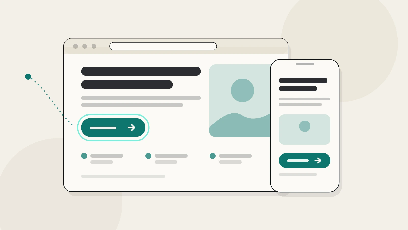
Many visitors will open the page on a phone, often in a hurry. The text should be readable without zooming, the buttons large enough to tap, and the page quick to load. In French and Arabic as well as English, check that the layout holds: longer words and right-to-left text can break a design that looked fine in one language.
6 A quick way to check yours
Show the page for a few seconds to someone who does not know your business, then hide it and ask three questions.
- What is this page offering?
- Who is it for?
- What would you do next?
If they hesitate over any answer, that is the first thing to fix. Change one element at a time and watch whether enquiries change, rather than redesigning everything at once.
In short: one goal, one promise, honest answers, one next step.